Gibson Research Consultancy
Web Design, Framer Build, MINI RE-brand

Overview
Platform
Web
Background
Gibson Research Consultancy are a well-established company providing multi-lingual patient research pharmaceutical, biotech, and medical sectors.
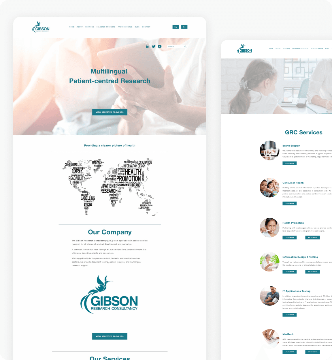
GRC felt their website was at odds with the professional reputation they’d built in their industry. It was aesthetically dated, awkward to navigate and lacked a clear call to action. They sought to present themselves as thought leaders and wanted their redesigned website to communicate this for them.
I was responsible for the design and build of the new website, and a refresh of the company’s visual branding to support their goals.
Discovery
An audit of the current website revealed multiple UX problems. There were readability and accessibility issues, a lack of hierarchy and no clear call to action.
I conducted general research into the client's field and competitor analysis to understand where they were positioned.


I produced three concepts for a new aesthetic direction that together with a more usable website would help present them in a more authoritative light.
The direction they chose was inspired by printed scientific journals. It has a scholarly feel with some modern accents.

Making sense of Services
The services on the existing site were awkward to navigate, presented in a long list in no particular order. All buttons on the site looked the same with no hierarchy between them.
I drew out the four services most commonly requested by customers (and those the client were most interested in providing) and gave them more prominence on the services page, separating them from the secondary services.


Cultivating thought leadership
One of the ways GRC sought to speak with more authority through their website was through their resources page. Their previously inflexible blog page was expanded to house the other kinds of content they were producing, including webinars and whitepapers. A custom CMS built in Framer that gave them more control.
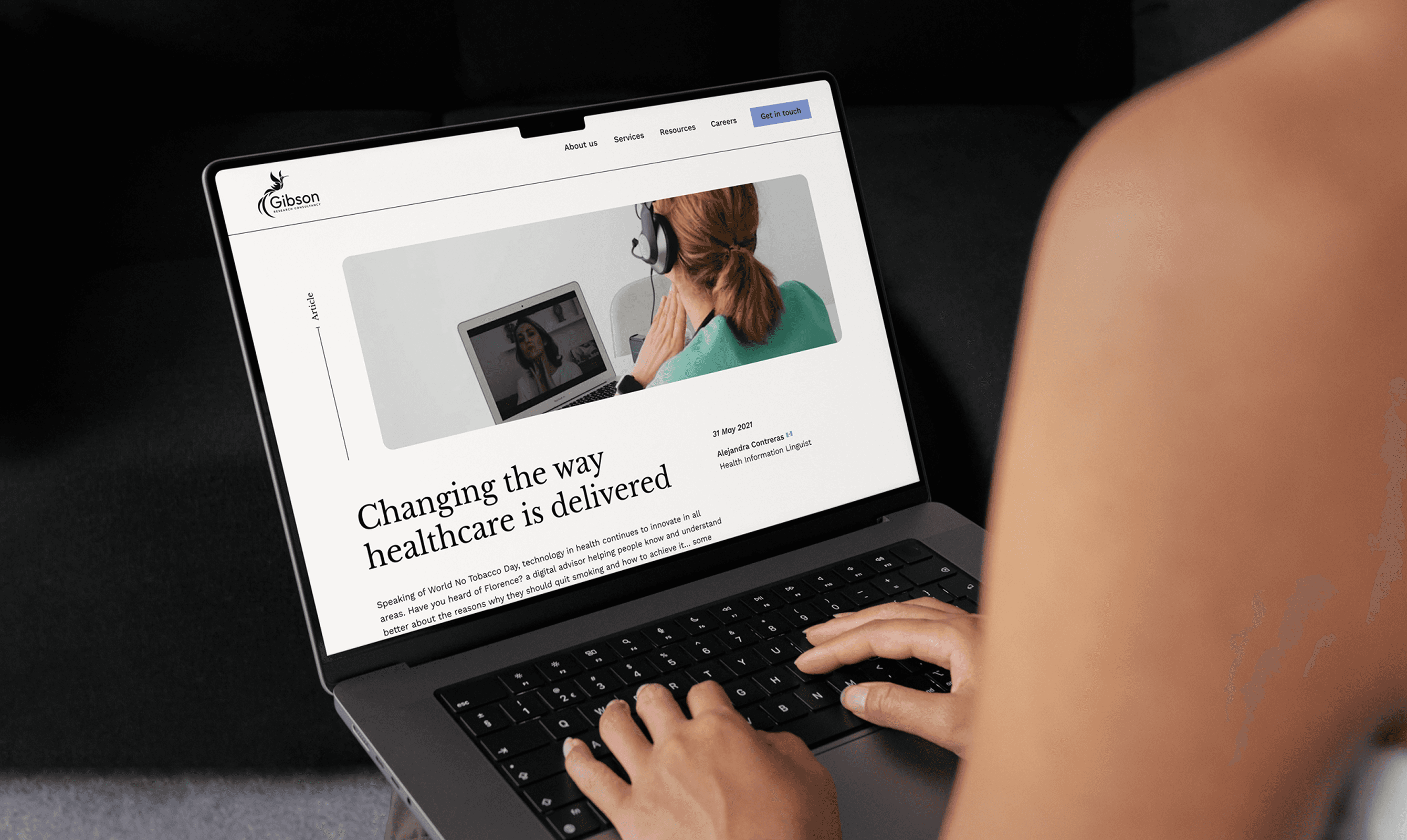

I drew out key stats previously hidden in body copy to make more of them on the about page, drawing attention to them with scaled up numbers and custom icons.
The high contrast between the colours in the new palette allowed for more visible calls to action.

